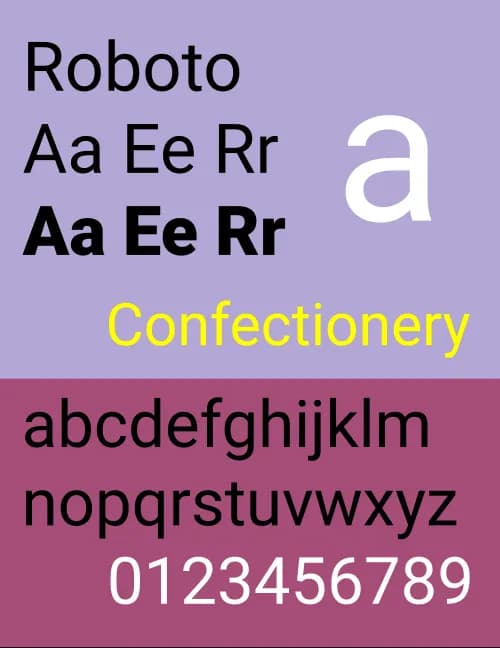
Roboto
Roboto strikes a balance between mechanical precision and a friendly, approachable design. Its geometric structure is paired open, inviting curves. Unlike some grotesks that distort their letterforms to maintain strict uniformity, Roboto allows each letter to retain its natural width. This results in a more fluid and human-like reading experience, reminiscent of humanist and serif typefaces.
400
36px
0px
1.2
Variable
Variable
400
36px
0px
1.2
Variable Italic
Variable Italic
400
36px
0px
1.2
Thin
100
100
36px
0px
1.2
Thin Italic
100 Italic
100
36px
0px
1.2
Extra Light
200
200
36px
0px
1.2
Extra Light Italic
200 Italic
200
36px
0px
1.2
Light
300
300
36px
0px
1.2
Light Italic
300 Italic
300
36px
0px
1.2
Regular
400
400
36px
0px
1.2
Regular Italic
400 Italic
400
36px
0px
1.2
Medium
500
500
36px
0px
1.2
Medium Italic
500 Italic
500
36px
0px
1.2
Semi Bold
600
600
36px
0px
1.2
Semi Bold Italic
600 Italic
600
36px
0px
1.2
Bold
700
700
36px
0px
1.2
Bold Italic
700 Italic
700
36px
0px
1.2
Extra Bold
800
800
36px
0px
1.2
Extra Bold Italic
800 Italic
800
36px
0px
1.2
Black
900
900
36px
0px
1.2
Black Italic
900 Italic
900
36px
0px
1.2