Crimson Pro
The quick brown fox jumps over the lazy dog 0123456789
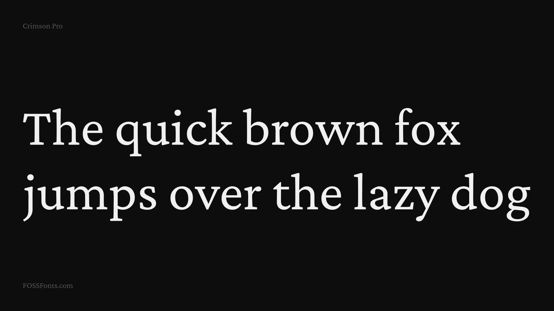
Crimson Pro is a serif typeface family: Contemporary, clear, classic and rounded/open. Something for a college textbook, editorial websites and any reading experience with book-length texts It contributes to the tradition of beautiful Garamond-inspired typefaces, often called “Garalde” or “Old Style,” and has 8 named weights, in Roman and Italic, and is available as a Variable Font with a Weight axis. The first Crimson design was initiated by Sebastian Kosch in 2009, and he later completely redrew a new version called Crimson Prime. Google commissioned Jacques Le Bailly to review both typefaces, and develop Crimson Pro as a new design that synthesises both designs into a final authoritative family, first released in January 2019. All decisions were made to enable better readability for longer texts and the ability to make good and diverse typography.